It’s funny how the blogosphere erupts every time a new color trend is announced. From Pantone’s Radiant Orchid to Tangerine Tango, these bright picks always become an instant craze. However, they usually burn out pretty quickly. Chances are, bright hues of orange and pink won’t last in your mountain style home long-term. And this is exactly why warm, organic color palettes are what I build my designs around.
When your home is decorated with natural colors, your space is easier to live in. That’s because when you’re surrounded by off-the-wall colors, you’re more likely to be on edge and alert. If you prefer to relax and unwind, warm shades of brown will allow you to do just that.
Brown is said to evoke feelings of “stability, reliability and approachability.” Most things in nature are some shade of brown, which makes it the most natural color you could possibly incorporate into your mountain style home. But that’s not all. Brown affects us physically and psychologically as well by making us feel whole and connected with the earth. In fact, Pantone’s Fall 2014 color trend report includes a very natural shade of brown known as Cognac.
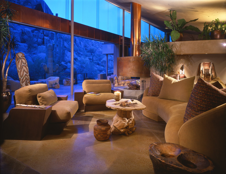
When choosing your neutral palette, be very aware of your home’s lighting. As much as we love brown, it can make for a dark and dreary space when the lighting isn’t quite right. Natural sunlight will always work wonders, but if that’s not possible, go with lighter shades such as cream. The room pictured above displays the best of both worlds. Not only is there a great view of natural elements outside, but it’s also a room full of soft natural colors. You can clearly see that even once the sun sets, this room never goes dark.
My design team would be honored to devise a customized and personalized natural color scheme for your mountain style home. Contact us at Paula Berg Design Associates in Park City or Scottsdale to learn how we can make natural, neutral and rustic colors work for your living space for years to come.